
Power BI dashboards that make CPG decisions easier.
Unify distributor and syndicated data into a single, trusted view of sales, velocity, distribution, and promo—built for founders and sales teams.
Common Signs Your Data Isn’t Working for You
-
"Multiple data sources. No single source of truth."
- Your CEO
-
"Dashboards exist, but no one trusts them."
- Your Sales Manager
-
"Sales asks questions that we can't answer fast."
- Your Marketing Manager
-
We're drowning in spreadsheets and weekly fire drills."
- You
If these sound familiar, you don’t need more reports —
you need a better system.
Your Data Has Answers. We Help You Find Them.

Syndicated Data
SPINS, NielsenIQ, Circana—syndicated data is powerful, but only if it’s easy to use. We structure, normalize, and visualize syndicated data so teams can quickly understand trends, velocity, distribution, and performance without digging through spreadsheets or static reports.

Distributor Data
Distributor data is messy, inconsistent, and often underutilized. We consolidate data from partners like UNFI, KeHE, and others into a single, trusted view—making it easy to understand performance by distributor, DC, item, or store and quickly identify gaps, voids, and opportunities.

Direct Retailer Data
Whether it’s Whole Foods, Wegmans, Walmart, or another retailer, direct data can unlock powerful insights at the store level. We transform raw retailer files into intuitive dashboards that highlight velocity, distribution issues, and lost sales—so teams know exactly where to focus.
Check out some real world example dashboards…
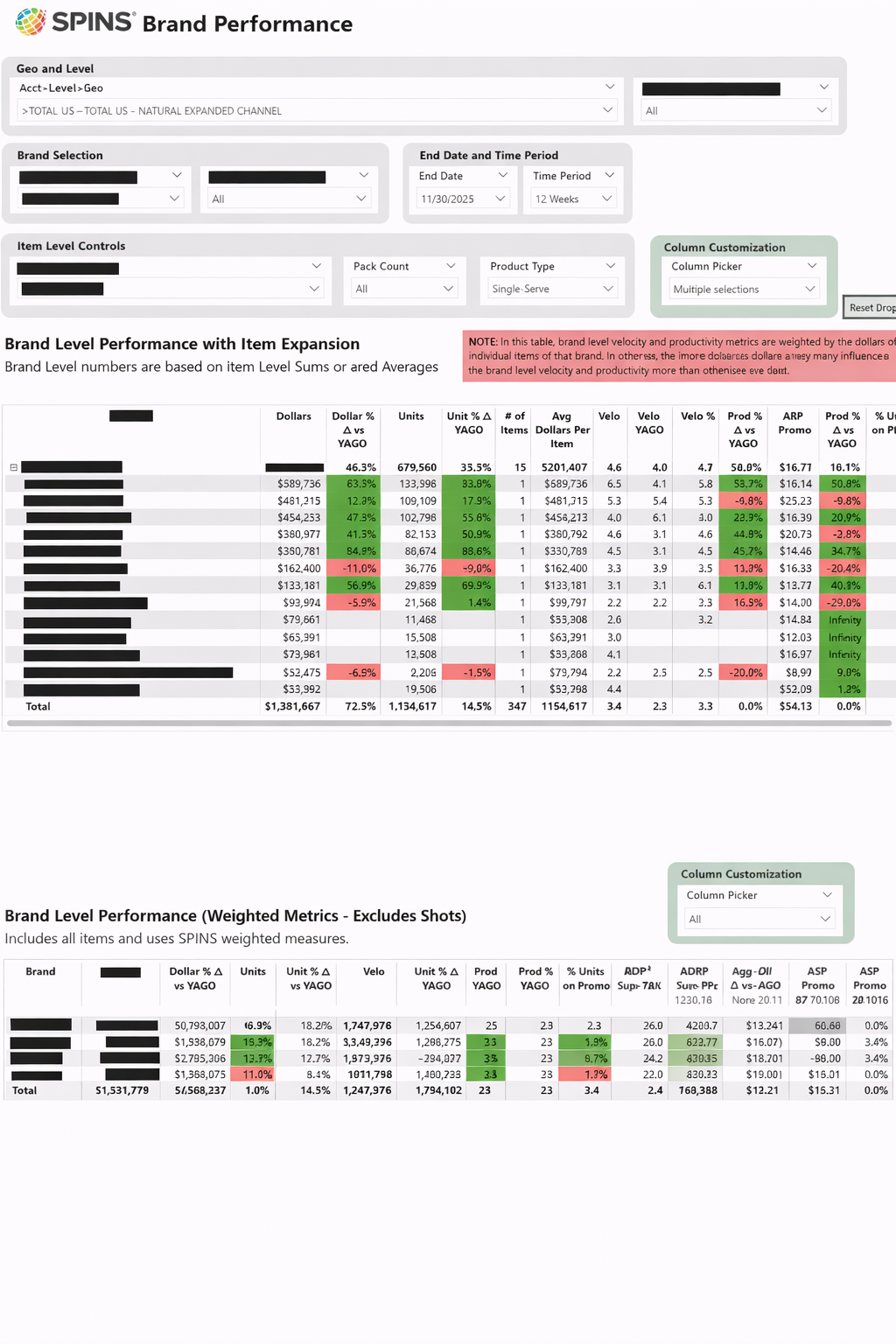
Our client wanted to see just their competitive set rolled up at a brand level with the ability to quickly expand to see all the items within that brand. This chart also has the ability to toggle on/off metrics so they can quickly create a visual (with only the metrics they want to show) to copy/paste into their sales decks.
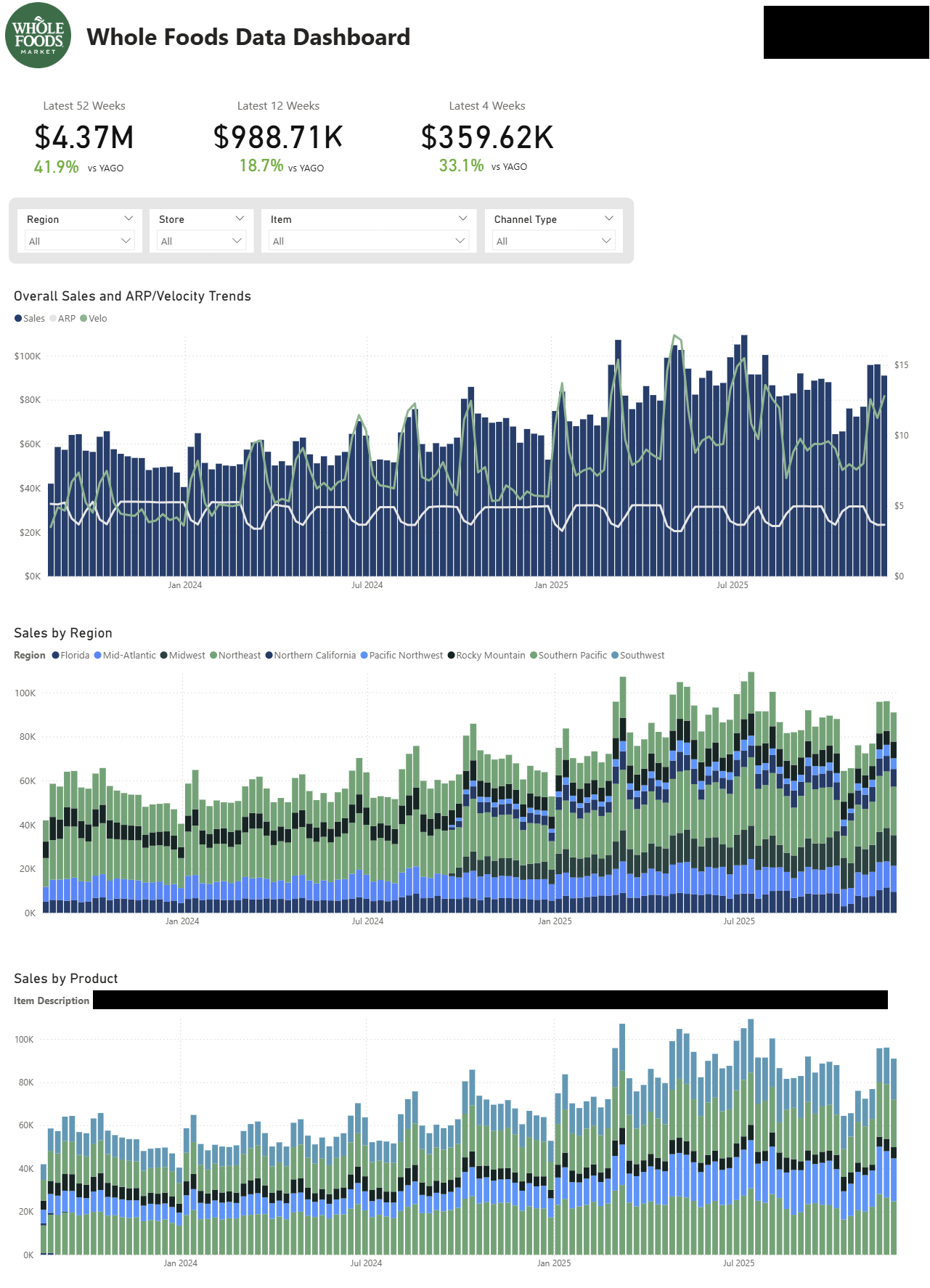
Many of our clients sell through Whole Foods, where understanding weekly, store-level performance is essential for driving growth and controlling costs. We build custom Whole Foods dashboards that clearly surface key metrics such as velocity by store, distribution gaps and voids, and lost sales opportunities—allowing teams to quickly identify issues, prioritize actions, and make informed decisions that improve performance across the network.
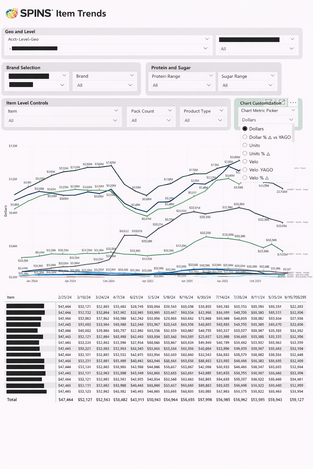
This report gives brands a true item-level command center. With a single view, teams can track dollars, units, velocity, productivity, ARP, store count, TDP, and key percent-change metrics for any SKU over time. Instead of reacting to topline shifts, this dashboard helps brands understand why performance is changing—what’s driving growth, what’s slowing, and where opportunity still exists. The result is clearer selling stories, stronger buyer conversations, and the confidence that comes from knowing your data better than anyone else in the room.
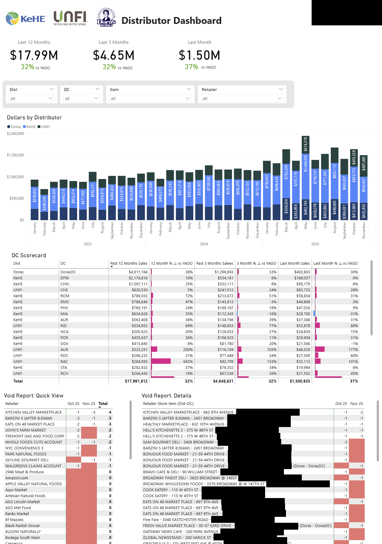
One of our core reports is a consolidated distributor dashboard that provides a single, unified view of performance across all distributors. From this high-level perspective, users can quickly drill down to an individual distributor, DC, or even store level to understand where the business is performing well—and, more importantly, where challenges exist—so issues can be addressed quickly and growth opportunities can be captured.
CPG Data Nerds have deep experience across natural, specialty, and emerging CPG brands.